The design of the website https://usptis.com/ reflects a modern and clean approach aimed at building trust and demonstrating professionalism within the insurance industry. The site makes effective use of white space, concise headings, and well-organized sections to ensure that visitors can easily navigate and understand its offerings.
Visual Structure and Layout
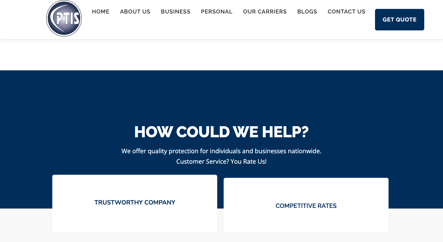
The homepage utilizes bold, prominent headings like “Trustworthy Company,” “Competitive Rates,” and “Insurance For Everyone,” which guide users through the main selling points and values of the agency. Content is segmented into short, easy-to-read paragraphs and bullet points, enhancing accessibility and flow. The overall structure is client-focused and highlights the agency’s long-standing relationships and award-winning service.
Color Scheme and Typography
The color scheme is subtle, likely featuring neutral and calming tones suitable for the insurance sector, though the exact palette may vary across devices and future updates. Typography appears professional and clear, with straightforward headings and body text, ensuring high readability and reinforcing trust.
User Experience
Navigation is intuitive, with sections like “About Us,” “Why Choose Us,” and details about the team and achievements presented in a logical order. The website emphasizes user comfort and knowledge by simplifying insurance concepts and offering accessible forms for customer inquiries.
Branding and Professionalism
Prominent mentions of awards, client focus, and years of experience are strategically placed to build credibility. The website features multiple calls to action, including contact and inquiry forms, which foster engagement and ensure visitors are guided toward useful actions.
In summary, the design of https://usptis.com/ combines clear navigation, professional visuals, and client-centered messaging to create a reassuring and effective online presence for an insurance agency.