The website for Right Choice Pro Audio & Lighting (https://rcproaudio.com/) features a straightforward and professional design that aligns with its technical and service-oriented business.
Overall Look and Feel
The site uses a clean and simple layout, with a focus on functionality over heavy visual effects. It has a modern but minimalist aesthetic, where large sections are divided clearly with background colors and images to separate content areas. The overall impression is practical and businesslike, consistent with a company that specializes in professional audio and lighting systems.
Color Scheme and Typography
The color palette is primarily composed of whites, grays, and darker tones, creating a neutral and professional appearance. These muted colors keep attention on the content and photos of installations. The fonts are simple and sans-serif, providing good readability. Text spacing and alignment are consistent, which helps maintain a structured visual flow throughout the pages.
Layout and Structure
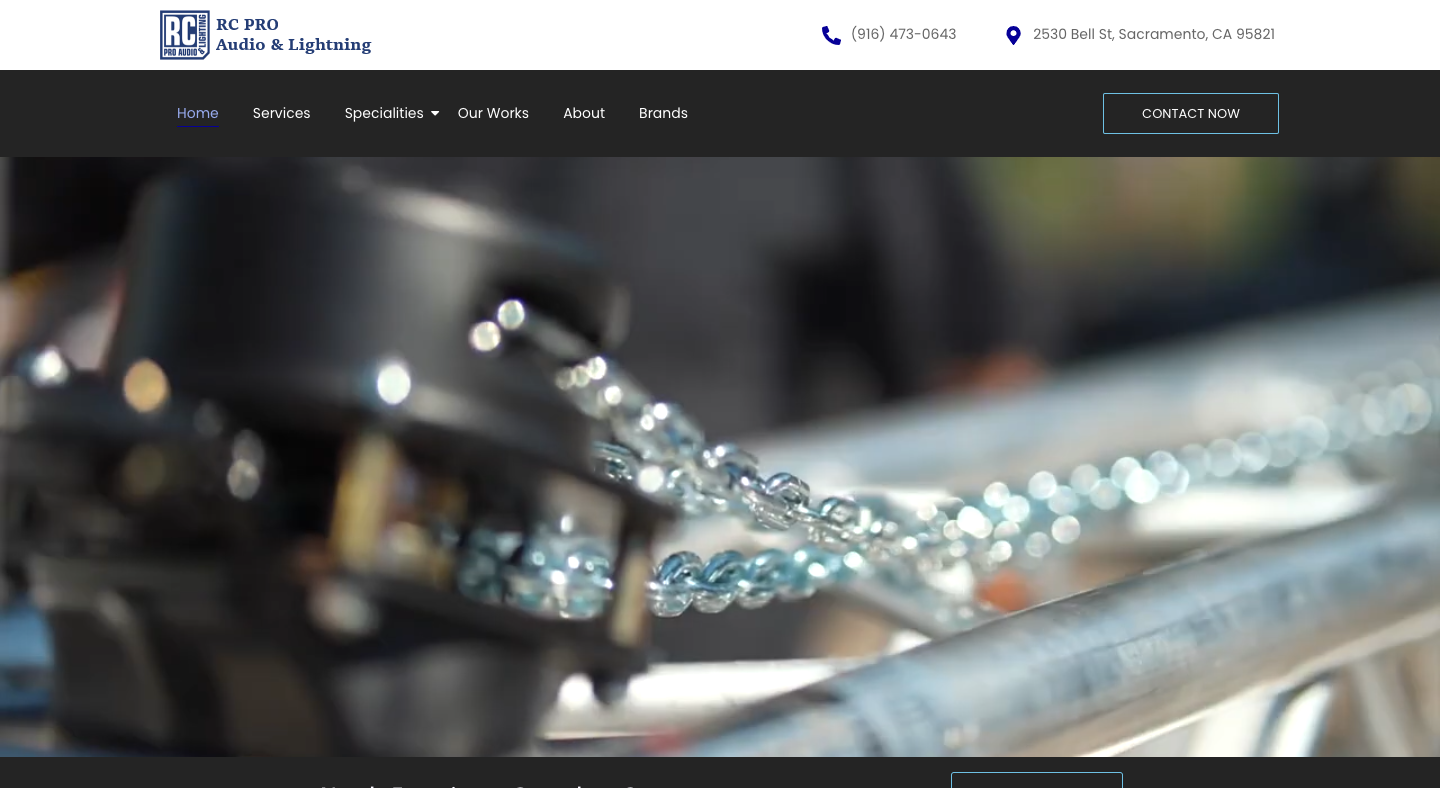
The website follows a traditional layout: a header with navigation links, a large hero image, content sections below, and a footer with contact details. The header remains clean with clear navigation links such as Home, Services, Specializes, Our Works, and About Us. The content areas are arranged vertically, using full-width sections that alternate between text and images.
The hero section includes a wide image banner and brief text summarizing the company’s offerings, giving an immediate sense of what the site represents. Below, sections are well-defined, though relatively static, using a combination of short text blocks and illustrative photos.
Imagery
Images play an important role in conveying the company’s work. The photos used — such as installations, lighting setups, and equipment — are high-resolution and relevant, helping visitors visually connect with the services offered. The visual tone is technical and professional, consistent with an AV installation company.
Navigation and User Flow
Navigation is straightforward and intuitive. The top menu is easy to locate and use, and page transitions are smooth. The user can easily find essential information such as services, company background, and contact options. The footer repeats key contact information and social links, giving the site a balanced structure from top to bottom.
Responsiveness and Consistency
The design is responsive, adapting well to different screen sizes. On smaller devices, the navigation collapses into a mobile-friendly menu, and text and images resize appropriately. The consistent use of layout grids and spacing maintains visual order, whether viewed on desktop or mobile.
Visual Hierarchy
The visual hierarchy is clear, with titles and section headings set apart by size and weight. Important text elements stand out well against background colors, ensuring readability. However, the design remains modest — it avoids bright colors or complex visual layering, focusing instead on clear presentation.
In summary, the web design of Right Choice Pro Audio & Lighting is professional, simple, and functional. It emphasizes clarity, easy navigation, and relevant imagery over flashy design elements. The site effectively communicates reliability and expertise through a straightforward layout and consistent visual presentation.