The site presents a clean and calm aesthetic suitable for a health-and-dental themed site. The colour palette uses soft tones (whites, light greys) which promote a sense of hygiene and clarity. The typography is simple and readable, with headings clearly distinguished from body text.
Layout & Structure
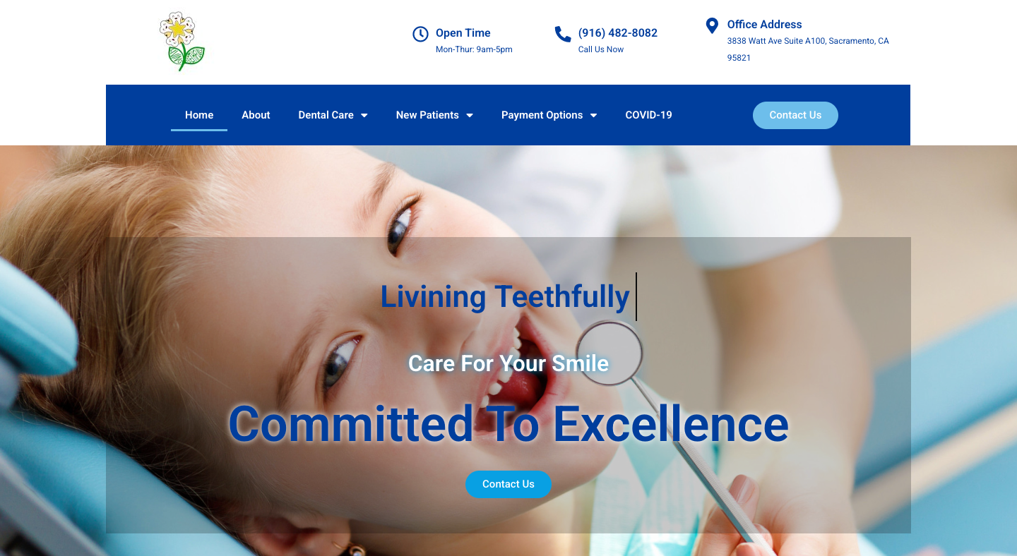
The homepage features a hero banner with a strong image related to dental health, followed by article or blog-style sections that are organized vertically. Navigation appears minimalistic, with menu items that allow access to key content. The overall structure is straightforward — header, main content, footer — and it’s easy for a visitor to scroll and find information without distraction.
Imagery & Visual Elements
High-quality imagery is used, including photos of healthy smiles, teeth care routines, and dental health visuals. These visuals align well with the site’s theme and help reinforce the health and wellness message. The visuals are appropriately placed and don’t overwhelm the text.
Readability & Typography
The site uses ample white space and comfortable line-lengths, which supports readability. Text is clear and well-spaced. Headings are bold enough to segment content meaningfully, and the contrast between text and background is good. That makes reading easier, especially for health-related content where clarity matters.
Mobile & Responsive Behavior
From what I could observe, the site adapts well to smaller screen sizes: menus collapse appropriately, images resize, and content remains readable. The responsiveness supports the user experience on mobile devices, which is important given how many people browse health content on phones.
Navigation & User Flow
The navigation is simple, not overly complex, which is appropriate for the kind of site this is. A visitor can quickly locate information about “how to care for teeth”, browse blog posts or articles, and move between sections without getting lost. The calls to action (though not too aggressive) are visible and the overall flow from introduction → content → further reading is logical.
Summary
The web design of Living Teethfully communicates its purpose well: it’s a clean, calm, health-oriented site that uses appropriate visuals, readable typography, and a user-friendly layout. It’s not overly flashy, which fits the subject matter (oral health) — the design supports trust and ease of use.