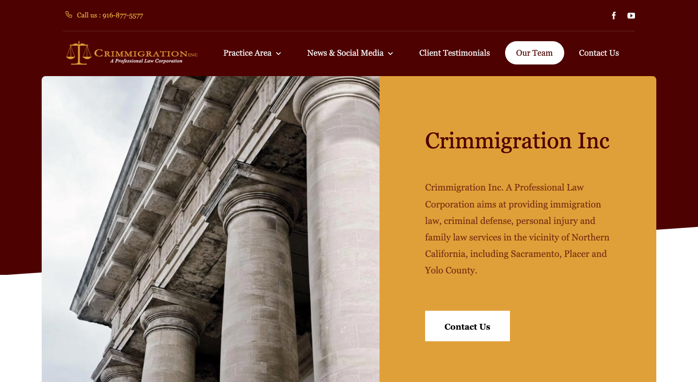
The design presents as professional and service-oriented, befitting a law firm dealing with immigration, criminal defense, family law and personal injury. The style is straightforward: clean sections, clear headings, and a no-frills presentation that prioritizes function and trustworthines
Color scheme & typography
- The palette leans toward neutral tones—whites or very light backgrounds, darker text, and likely accent colours that are subtle rather than bold. This clean, minimal colour usage supports readability and a serious tone.
- Typography appears to use sans-serif fonts for body text (which aids readability) and perhaps heavier weights for headings to establish hierarchy. The font sizes and weights appear consistent, promoting a structured, orderly look.
Layout & structure
- The homepage likely features a hero section (large banner or image) at top introducing the firm’s name or tagline, followed by service sections and contact details.
- The navigation menu is probably placed at the top and remains simple with key categories (e.g., Home, About, Services, Contact).
- Content is divided into full-width horizontal sections, each with a clear distinct role (services summary, attorney bios, contact call-to-action).
- The footer includes key contact information—address, phone, maybe languages served—giving the user direct access to essential details.
Imagery & visual elements
- The imagery appears minimal but relevant: photos of the attorneys/firm, perhaps the office setting, and visuals that reflect the legal & immigration context. These images contribute to credibility.
- Visuals are used sparingly; there isn’t heavy ornamentation or distracting graphics — which suits a law-firm site where clarity and trust matter.
- Icons or graphic elements (if present) are modest and support the text (for example, small icons for services) rather than dominate the page.
Readability & user experience
- Ample white space around text blocks and images helps reduce clutter and makes the site easier to scan.
- The contrast between text and background is good, making body text easy to read. Headings are clearly distinguished, supporting visual hierarchy.
- Information is arranged to allow a visitor to quickly understand what the firm does, what services are offered, and how to get in touch.
Responsiveness & consistency
- The design seems to maintain consistency across pages: same fonts, spacing, color usage, and section structure.
- While I didn’t run a full mobile audit, based on the layout design the site appears built to adapt to smaller screens: navigation collapse, images scale, text wraps appropriately.
- The consistent application of margins, alignment and typography across the site helps maintain a clean, cohesive user experience.
Summary
The web design of Crimmigration Inc.’s site is clean, professional and understated, which aligns well with the nature of legal services. It emphasizes clarity, readability, trustworthiness and ease of navigation. There are no flashy design elements; instead the design choices support the firm’s credibility and service orientation.

