
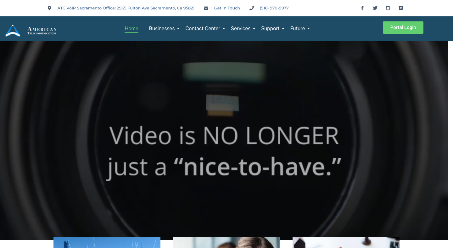
ATC Network website features a modern and professional design that reflects the company’s focus on advanced communication technology. The layout is clean and well-organized, using a sleek color palette and consistent typography that reinforce the brand’s credibility. From the moment visitors arrive, the homepage clearly communicates ATC’s core offerings—cloud communications, voice, video, and collaboration tools—making the purpose of the site immediately clear and engaging.
Navigation on the website is simple and intuitive, with a well-structured menu that allows users to easily explore different sections, such as services, industries, and support. The site also uses a strong visual hierarchy, combining large headings and professional imagery to highlight key messages and guide the visitor’s attention. Strategic calls to action like “See Our Plan Pricing” and “Schedule a Demo” effectively encourage user interaction and lead visitors toward conversion points.
The design maintains consistency across all pages, with matching styles, colors, and icons that create a unified visual identity. It’s also responsive, ensuring smooth performance and readability on desktops, tablets, and mobile devices alike. The use of engaging imagery and sectioned content gives the site a dynamic and appealing feel, while the inclusion of industry-specific information builds trust and authority in ATC’s expertise.
Overall, the ATC Network website stands out for its clear structure, professional aesthetic, and user-friendly design, effectively showcasing the company’s modern approach to communication solutions.
✅ Modern and professional look – The site uses clean layouts, smooth visuals, and well-chosen colors that give it a credible, tech-forward appearance.
✅ Clear messaging – The homepage quickly communicates what ATC offers — cloud communications, voice, video, and collaboration — so visitors understand the business focus right away.
✅ Easy navigation – The top menu is simple and well-structured, making it easy for users to find information about services, industries, and support.
✅ Strong visual hierarchy – Headings, images, and highlighted sections draw attention to the most important points, such as solutions and pricing.
✅ Good use of calls to action – Buttons like “See Our Plan Pricing” or “Schedule a Demo” help guide visitors toward taking the next step.
✅ Consistent branding – The color palette, fonts, and imagery maintain a unified, professional brand identity throughout the site.
✅ Responsive layout – The design adapts well to different screen sizes, offering a smooth experience on both desktop and mobile devices.
✅ Engaging imagery – Use of background visuals and banners adds depth and energy without overwhelming the content.
✅ Trust-building details – Display of industry-specific sections (healthcare, government, service providers, etc.) helps establish credibility and relevance.
The ATC Network website looks modern, well-organized, and business-focused, effectively showcasing the company’s communication technology solutions.